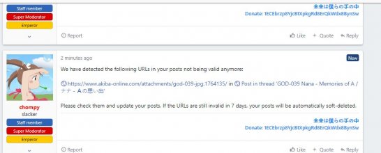
One thing that maybe has not been explicitly pointed at yet: the bottom section with navigation and "About us" is too big, considering that it is redundant (the same links are at the top) and a bit... moot:
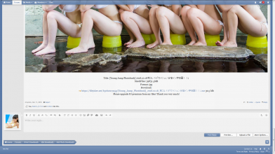
/screenshot taken from cache, this page still lives for me with old style
This might be true, but do we need 1/3 of screen's height to display these few words? Looking at the old design, it looks way neater on the bottom.Our community has been around for many years and pride ourselves on offering unbiased, critical discussion among people of all different backgrounds. We are working every day to make sure our community is one of the best.
/screenshot taken from cache, this page still lives for me with old style


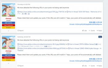
 Footer doesn't serve any big purpose, and it's so easy to admire its vast spaces and redundant text even when checking new posts only:
